
Stylish Neutrals: How to Choose Coordinating Outfits for Family Photos
- Jessica Kemp
- Feb 9
- 2 min read


Capturing family moments in photos is a special occasion that calls for thoughtful outfit choices. The right clothing can enhance the overall look, create harmony, and make your photos timeless. Many families ask to to help them with what to wear, especially when trying to avoid outfits that are too matchy-matchy but still look coordinated. Choosing neutral and coordinating styles offers a simple yet elegant solution that works well for all and allows you and your loved ones to be the focus of the images.
This guide will walk you through how to select stylish outfits that complement each other! You’ll find practical tips, color palette ideas, and styling advice to help your family photos look polished and natural.
Why Choose Neutrals for Family Photos
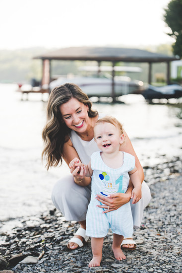
Neutral colors like beige, cream, gray, soft browns, and muted pastels create a calm and cohesive look. They don’t compete with the background or distract from faces, which keeps the focus on your family’s expressions and connection.
Benefits of neutrals:
Timeless and classic look that won’t feel dated
Easy to mix and match without clashing
Flattering on all skin tones
Works well in any season or location
Allows subtle pops of color through accessories if desired
Neutrals also help avoid the “everyone in the same outfit” problem. Instead of matching exactly, family members can wear different shades and textures within the neutral spectrum for a coordinated but relaxed style.


Start by choosing a base color and then add complementary neutrals around it. Here are some popular neutral palettes that work beautifully for family photos:
Warm neutrals: Cream, camel, soft brown, rust, and ivory
Cool neutrals: Light gray, charcoal, soft white, slate blue, and dusty lavender
Earthy neutrals: Olive green, tan, beige, muted mustard, and stone gray
Tips for choosing your palette:
Pick 2-3 main colors and 1-2 accent shades to keep the look balanced
Use lighter shades for younger children and darker tones for adults to create natural contrast
Incorporate different textures like knitwear, linen, denim, or suede to add depth
Coordinating Without Matching
The key to coordinating is to create a visual flow without everyone wearing the exact same outfit. Here’s how to do it:
Choose a color palette and assign each family member 1-2 colors from it
Mix solid colors with subtle patterns like stripes or small checks
Use accessories like hats, scarves, or belts to tie colors together
Vary textures and fabrics to add interest without clashing
Keep the overall style consistent (casual, semi-formal, etc.)
Final Tips for a Polished Look
Avoid large logos, large graphics, or distracting patterns
Make sure clothes fit well and are comfortable
Coordinate shoes and accessories but keep them simple
Plan outfits ahead of time, feel free to send me images of you outfits if you would like feedback or suggestions
Bring a few backup options for kids in case of spills or discomfort
Choosing neutral, coordinating outfits for your family photos creates a timeless look. By mixing shades, textures, and styles within a thoughtful palette, you avoid matching too closely while still looking connected and beautiful together. This approach ensures your photos will feel natural and stylish for years to come.


Comments